Population Inference Using a Hidden Markov Model Approach
STAT 494 Final Project
Author
Ronan Manning, Rylan Mueller, Lucas Nelson
Published
May 5, 2025
Introduction
Using genetic data, it is possible to determine a person’s genetic origin. In other words, once a geneticist analyzes an individual’s DNA, it can be inferred what geographic location their ancestors are from. This discovery can provide new understanding to historical mixing of populations and the potential detection of diseases in certain populations. We were curious if this could be done in a simulation study using a Hidden Markov Model.
Can a person’s genetic origin be determined from their DNA after several generations of movement and reproduction in a simulation study?
Before jumping in, there are some key definitions you need to understand first.
Allele - different possible nucleotides at a location on the genome
Minor Allele Frequency (MAF) - the frequency that the less common allele is present at that location
Single Nucleotide Polymorphism (SNP) - A position on the genome where the MAF is greater than 1%
Recombination - parts of DNA being broken and reordered
Admixture - the mixing of populations resulting in a new population from multiple sources
Linkage - genes close together on the genome are more likely to be passed down as a unit
Simulating Data
To answer the research question, we start with simulating data. First, we created a 10 x 10 grid with 10 individuals in each square.
With 10 individuals in each square and 100 squares, we have enough data to simulate both movement and reproduction. Before exploring how those were accomplished, it is important to split individuals into separate regions for creating genetic variation between regions.
As you can see above, the grid is split into two identically sized regions - fifty squares in region 1 and fifty squares in region 2. To simulate genetic variation between regions, we simulated 1,000 SNPs for each individual. Of those SNPs, 500 are SNPs correlated to the region the individual starts in and the other 500 are uncorrelated to the region. This correlation is accomplished by changing minor allele frequency (MAF) depending on the region, as you can see below.
Movement
Now that the individuals have identifying DNA to their region, we can start moving them around the grid.
To move between squares, it is assumed that an individual is most likely to move to an adjacent square, or one nearby. This is not identical to real life. If an individual moves in real life, they could move to a city or not to an adjacent town, but for purposes of our simulation study, we assume that nearby squares are the most likely places for individuals to move.
The below matrix shows the squares an individual starting near the center of the grid could land after one generation of movement.
With around a 65% chance, the most likely location for an individual to end up after one generation of movement is the same square. That probability isn’t necessarily translatable, though. If an individual is in a square near the edge, their probability of staying in the same square increases.
With an individual starting in a corner, they have an 81% chance of not moving.
For each individual, in each square, this process is run. So for the 10 individuals in the bottom left corner, each has an 81% chance of staying. However, there is only about a 12% chance (0.81^10) of all 10 staying. Once all 1,000 individuals are “moved” (either to a new square or their initial square), one stage of movement is complete. For this study, we simulate 10 stages This allows opportunities for individuals to move to a new region, or just generally move around. The below graph shows the count of individuals per square after 10 generations.
As you can see, there is one square in the middle with no one. This happened in this specific simulation (seed set at 494), but other simulations would obviously have different results. Because movement is random, and no one is forced to relocate anywhere specific, oddities like this can happen.
Reproduction
However, only looking at movement isn’t enough. To answer our research question, we also need to simulate reproduction between each stage of movement.
For each square, two random individuals are sampled to create offspring. Remember, there are 1,000 SNPs for each individual. For each SNP, there is a 50% chance of Parent 1 contributing DNA and a 50% chance of Parent 2 contributing DNA. In real life, there would be a chance of mutation, though we ignored that possibility for two reasons. First, mutations are extraordinarily rare in real life, so to accurately capture the chance of a mutation, they would almost never happen in this study. Second, it was easier to simulate the data without mutations.
The process of reproduction is repeated for as many times as their are individuals in the square. So when there are 10 individuals in a square pre-reproduction, there will be 10 individual in that square post-reproduction. But, as explained above, movement is random. In this study, there was one generation with a square containing only 1 individual. Because they did not have a partner, they did not reproduce and “died off”, meaning that after 10 generations, the study was left with 999 individuals.
It is also important to note that because reproduction occurs between any two random individuals in the square, there is a possibility of multiple individuals not reproducing whatsoever. This also means that there are no “nuclear families.” An individual could reproduce numerous times, each with a different partner. There is also no gender designation in this simulation.
Throughout each generation, a “true” proportion of DNA from Region 1 and Region 2 is recorded. So if an individual from Region 1 and an individual from Region 2 reproduce, the child will be 50% Region 1 and 50% Region 2. Then if that child reproduces with someone 100% from Region 1, the newest child will be 75% Region 1 and 25% Region 2, and so on. This is tracked to measure against the Hidden Markov Model results later on. But following the true proportion allows us to visualize what the average origin of each square is.
The squares furthest away from the region border remain fairly homogeneous throughout all 10 generations, while squares near the border become heterogeneous.
The Minor Allele Frequency of each SNP will also change by region.
The MAF of the last 500 SNPs remains indistinguishable by region, regardless of the generation. However, as expected, the first 500 SNPs still show a distinction by region, though that distinction becomes more jumbled through each generation, as the regions are no longer isolated from each other.
Hidden Markov Model
A Hidden Markov Model (HMM) is a tool for representing probability distributions over a sequence of observations. In a HMM, sequences of observations are made that are produced by a process that can’t be observed, or is hidden. This hidden process is what HMMs are trying to model, to determine the most likely sequence of events that produced the observations we make. The hidden states are summarized by a set of probabilities called the transition probabilities, as they summarize the transitions from state to state, and the observations are summarized by the emission probabilities. These observations occur at discrete steps, which could be time in the future, or could also represent locations within a sequence. This model also assumes the Markov Property which states that the current hidden state only depends on the previous hidden state.
Example
To give us a little intuition about HMMs, let’s look at an example with weather. Let’s say we have a friend, John, in Wisconsin whose outfits only depend on the weather. We’ll make the assumption that the weather on one day is dependent on the weather from the previous day. In Wisconsin it can be sunny, cloudy, or rainy. When it’s sunny, the following day has a 60% chance of being sunny again, a 30% chance of being cloudy, and a 10% chance of being rainy. If it happens to be cloudy, the following day has a 50% chance of being cloudy, a 30% chance of being rainy and a 20% chance of being sunny. Finally the probabilities for when it’s rainy are as follows, 40% chance of being rainy the next day, 30% chance of being cloudy and 30% chance of being sunny. We can visualize these probabilities like this:
A visualization of weather probabilities dependent on the previous day’s weather.
The probabilities above are the transition probabilities. Now since we aren’t in Wisconsin, we can’t actually observe the weather, but John has a fashion blog where he posts pictures of his outfits so we are able to observe these. From these observations we know that when it’s sunny out John has a 70% chance of wearing yellow, a 20% chance of wearing blue and a 10% chance of wearing grey. Now when the weather is cloudy, John has a 50% chance of wearing grey, a 30% chance of wearing blue and a 20% chance of wearing yellow. Lastly, when the weather is rainy, John has a 80% chance of wearing blue, a 10% chance of wearing yellow and a 10% chance of wearing grey. These probabilities are the emission probabilities. Combining the emission probabilities with the transition probabilities we’re left with the visualization below.
The same visualization of weather probabilities with corresponding clothes probabilities dependent on weather.
The visualization above outlines the framework for a hidden markov model. Over a sequence of days, we make observations of John’s outfits and from this sequence we can determine the pattern the weather most likely took over that sequence. For example if, over three days, we observe the sequence of yellow shirt, yellow shirt, grey shirt, the most likely sequence of weather, based on the transition and emission probabilities, would be sunny, sunny, cloudy.
In a Genetic Context
Now that we understand a little more about HMMs, let’s translate that knowledge to a genetic context. In this case our hidden sequence consists of the origin of the person’s genome and the observed variables are the person’s genotypes. Using genome sequencing we’re able to determine the individual SNPs within a person’s DNA, but just because we know what the particular SNP is doesn’t mean we know the ancestral origin of that section of the DNA sequence. Using the STRUCTURE software, that is based on HMMs, we can attempt to determine the region of origin of the individuals. The equations below are the framework for the software:
Equations for the Hidden Markov Model
The first equation explains the probability for the origin of the first loci. After the origin of the first loci is determined, the software switches to the second equation where the hidden markov model becomes more obvious. The second equation has to do with moving from loci to loci and from one loci to the next. STRUCTURE has two options, the first being that the origin stays the same, summarized by the top equation. There are 2 ways to stay within the same origin, the first being no recombination occurring between loci. If we move from the first loci to the second and no recombination has occurred, there’s no way for the origin to differ. Now there’s also the chance that recombination has occurred, but it’s still possible that the recombination is still from the previous origin, summarized by the second term in the equation. The term exp(−dlr) represents the probability of no recombination occurring given the recombination rate (a poisson process) and the distance between loci. It follows that 1-exp(−dlr) would be the probability of recombination occurring, but k’ = k which explains the population of origin staying the same from one loci to the next. The second equation again calculates the probability of recombination occurring, with the expression 1-exp(−dlr), but here we change the population of origin for this chunk of the DNA as k’ is not equal to k.
Now that we have a bit of a better idea of the equations STRUCTURE uses to sift through the genome we can start to understand how the model runs. The STRUCTURE software can be found here, and is free to download. Now the first necessary item to run structure is genetic data. There are a few issues I’ve run into regarding the data formatting, the first being that you need column titles for the chosen SNPs. Individual and population markers are also necessary, however the population markers don’t seem to have too many constraints. The table below shows the ancestral percentages for individuals when a population marker was given for two distinct populations and then again when the marker was set to 0. As is evident in the table, the inferred clusters are almost exactly the same across the two tables despite the given population being different.
When running, STRUCTURE reads the mainparams document within the same folder as the program, so this document is where you would set all the parameters that structure relies on. The only assumption that is required for STRUCTURE is the number of populations the data comes from, so this will differ depending on the data, but an accurate assumption is crucial for STRUCTURE to run accurately. The rest of the mainparams file contains a number of other parameters including the number of individuals in the data, number of loci, along with others. Accurate parameter definitions are crucial for the program to run correctly.
Results
From the scatter plot, we can see that there is a fairly linear relationship between the “true” Region 1 percent and the prediction from the Hidden Markov Model. True is in quotes because it is as accurate as can be determined, but because it is not guaranteed that parents will each pass exactly 50% of relevant SNPs to their child, there could be some variation that is not accounted for in the “true” percentage calculation. So, while unlikely, it is possible that the Hidden Markov Model is more accurate than the “true” percentage.
Of the 999 individuals present at the end of the simulation, the HMM determined 724 of them correct within 5 percent. That is, if the true origin of an individual was 80% region 1, the HMM predicted the individual’s origin was somewhere between 75-85% region 1.
That error rate of 5% though, does not need to be set in stone. If we set the accepted error rate to 10%, the HMM predicted 881 individuals correctly.
Limitations
A few limitations that could be addressed in further work on this project include: more accurate representation of genetic data, non-random population movement, and more realistic passing down of genes. The genetic data we simulated only included 1000 SNPs and the full human genome contains around 3 billion base pairs, so the overall size of the data wasn’t the most realistic. SNPs are also more random than we determined them to be, so rather than the first 500 SNPs being different between the two populations and the next 500 being shared between the two, a better interspersing of SNPs would better replicate reality. STRUCTURE also uses the assumption that genes are passed down in “chunks” - replicating the idea of linkage - and our simulations did not take that into account. With that in mind the passing down of genes was not representative of reality. The movement included in this simulation was also completely random, where in reality there are motivations behind why/when/where people move, that our study did not capture.
Conclusion
Using a Hidden Markov Model, we can accurately determine a individuals origin in a simulation study.
Source Code
---title: "Population Inference Using a Hidden Markov Model Approach"subtitle: "STAT 494 Final Project"date: "May 5, 2025"author: "Ronan Manning, Rylan Mueller, Lucas Nelson"format: html: toc: true toc-depth: 3 embed-resources: true code-tools: true---```{r setup, include=FALSE}knitr::opts_chunk$set(echo =FALSE, error =TRUE, message =FALSE, warning =FALSE)``````{r}library(tidyverse)library(viridis)library(gganimate)library(lattice)```# IntroductionUsing genetic data, it is possible to determine a [person's genetic origin](https://www.nature.com/articles/nature07331.pdf). In other words, once a geneticist analyzes an individual's DNA, it can be inferred what geographic location their ancestors are from. This discovery can provide new understanding to historical mixing of populations and the potential detection of diseases in certain populations. We were curious if this could be done in a simulation study using a Hidden Markov Model.**Can a person’s genetic origin be determined from their DNA after several generations of movement and reproduction in a simulation study?**Before jumping in, there are some key definitions you need to understand first.::: {.callout-note appearance="minimal"}Allele - different possible nucleotides at a location on the genomeMinor Allele Frequency (MAF) - the frequency that the less common allele is present at that locationSingle Nucleotide Polymorphism (SNP) - A position on the genome where the MAF is greater than 1%Recombination - parts of DNA being broken and reorderedAdmixture - the mixing of populations resulting in a new population from multiple sourcesLinkage - genes close together on the genome are more likely to be passed down as a unit:::# Simulating Data```{r, eval = FALSE}#setupset.seed(494)ncols =10nrows =10squares = ncols*nrowsmovement_modifier =0.1num_generations <-10individuals_persq <-10total_individuals <- squares*individuals_persqnum_snps <-500region1 <-c(1:squares /2)region2 <-c((squares /2+1) : squares)region_dna <-tibble(current_square =rep(1:squares, individuals_persq), #when the simulation starts, the current square is the same as the starting square new_square =0, #this is the same as the new_generation vector in the initial simulationstarting_region =ifelse(current_square <= squares /2, 1, 2),Region1Percent =ifelse(starting_region ==1, 1, 0),Region2Percent =ifelse(starting_region ==2, 1, 0),generation =0,as_tibble(replicate(num_snps, rbinom(total_individuals, 2, starting_region /10)),.name_repair =~paste0("SNP", seq_along(.))), #SNP values determined by regionas_tibble(replicate(num_snps, rbinom(total_individuals, 2, 0.15)),.name_repair =~paste0("SNP", (seq_along(.)+num_snps))) #SNP values NOT determined by region ) %>%select(-starting_region) #I want this in the initial df to create the first 100 SNPs based on region, but it is not helpful later on``````{r, eval = FALSE}#Loops with movement and reproduction#I want this at the top so that I can easily create graphs as I goset.seed(494)for (generation_count in1:num_generations) {print(generation_count) location_df <- region_dna %>%filter(generation == generation_count -1)#movement loopfor (i in1:nrow(location_df)) {print(c(generation_count, i))#Translate index into an x,y starting location#There may be a better way to do this. However, the index of a vector starts at one (which equals the bottom left of a matrix) and goes to the max (which is the top right of the matrix). But in a matrix, (row 1, column 1) is the top right. So I need to essentially reverse all of the indices and then calculate the row and column that they're in. index =as.numeric(location_df[i, 1]) new_index = (squares +1) - index start_row <-ceiling(new_index / nrows) #calculate the row start_col <- new_index - (start_row -1)*(ncols) #determine the row we're in and then find how many squares we need to travel in that col start_location <-c(start_col, start_row) #This is inefficient making an index into an x,y coordinate and then translating it back into an index later#Create probability matrix and cumulative vector x_dist = movement_modifier^abs(ncols:1- start_location[1]) y_dist = movement_modifier^abs(nrows:1- start_location[2]) probability_matrix <-outer(x_dist, y_dist) #outer product of x and y distances probability_matrix = probability_matrix /sum(probability_matrix) #rescale so sum equals 1 cumulative_vector <-cumsum(as.vector(probability_matrix)) #translate matrix into a cumulative sum vector#Determine movement rn <-runif(1) #creates random number location <-sum(rn > cumulative_vector) +1#index of location in new vector#counting from bottom left across rows. Bottom left is 1, bottom right is 5, top left is 20, top right is 25 location_df[i, 2] <- location #sets new_square in the df based on movement } #ends movement loop location_df <- location_df %>%mutate(current_square = new_square)#reproduction loopfor (square in1:squares) {#filter to individuals in the same square and the proper generation square_df <- location_df %>%filter(current_square == square, generation == generation_count -1)if (nrow(square_df) >=2) { #add in check to make sure at least two individuals in each square to reproducefor (count in1:nrow(square_df)) { #Just replace population with the same number#if we really cared about male/female, add a column designating gender, then filter to create a male_df and female_df and only sample one from each#get two random individuals from the square parents <- square_df[sample(nrow(square_df), 2), ] parents_snps <- parents[, 6:1005] child_snps <-as_tibble_row(mapply(function(x, y) sample(c(x, y), 1), parents_snps[1, ], parents_snps[2, ])) #Could add the Poisson distribution, probably have to determine where splits are then do DNA stuff new_child <-tibble(current_square = square,new_square =0,Region1Percent = (as.numeric(parents[1, 3]) +as.numeric(parents[2, 3])) /2,Region2Percent = (as.numeric(parents[1, 4]) +as.numeric(parents[2, 4])) /2,generation = generation_count, child_snps) region_dna <- region_dna %>%add_row(new_child) } } } #ends reproduction loop}#write as a csv to make knitting easier# write_csv(region_dna, 'allgenerationsdna.csv')``````{r}ncols =10nrows =10squares = ncols*nrowsregion1 <-c(1:squares /2)region2 <-c((squares /2+1) : squares)region_dna <-read_csv('Data/allgenerationsdna.csv')```To answer the research question, we start with simulating data. First, we created a 10 x 10 grid with 10 individuals in each square.```{r}individuals_viz <- region_dna %>%filter(generation ==0) %>%group_by(current_square) %>%summarize(count =n()) %>%mutate(row = (current_square -1) %/% ncols +1,col = (current_square -1) %% ncols +1)individuals_viz %>%ggplot(aes(x = col, y = row, fill = count)) +geom_tile() +scale_fill_viridis(option ="magma", direction =-1) +coord_equal() +theme_minimal() +scale_x_continuous(breaks =c(2, 4, 6, 8, 10)) +scale_y_continuous(breaks =c(2, 4, 6, 8, 10)) +labs(x ="", y ="", fill ="Count", title ="Count of Individuals by Square")```With 10 individuals in each square and 100 squares, we have enough data to simulate both movement and reproduction. Before exploring how those were accomplished, it is important to split individuals into separate regions for creating genetic variation between regions.```{r}region_matrix_viz <- region_dna %>%filter(generation ==0) %>%mutate(Region =ifelse(current_square %in% region1, 1, 2), .before = Region1Percent) %>%group_by(current_square) %>%summarize(Region =mean(Region)) %>%mutate(row = (current_square -1) %/% ncols +1,col = (current_square -1) %% ncols +1)region_matrix_viz %>%ggplot(aes(x = col, y = row, fill =as.factor(Region))) +geom_tile() +scale_fill_viridis_d(option ="magma", direction =-1) +coord_equal() +theme_minimal() +scale_x_continuous(breaks =c(2, 4, 6, 8, 10)) +scale_y_continuous(breaks =c(2, 4, 6, 8, 10)) +labs(x ="", y ="", fill ="Region", title ="Grid Split Into 2 Regions")```As you can see above, the grid is split into two identically sized regions - fifty squares in region 1 and fifty squares in region 2. To simulate genetic variation between regions, we simulated 1,000 SNPs for each individual. Of those SNPs, 500 are SNPs correlated to the region the individual starts in and the other 500 are uncorrelated to the region. This correlation is accomplished by changing minor allele frequency (MAF) depending on the region, as you can see below.```{r}region_dna %>%filter(generation ==0) %>%mutate(Region =ifelse(current_square %in% region1, 1, 2), .before = Region1Percent) %>%group_by(Region) %>%summarize(across(starts_with("SNP"), ~mean(.x))) %>%pivot_longer(cols =starts_with("SNP"), names_to ="SNP", values_to ="mean") %>%mutate(SNP =as.numeric(str_remove(SNP, "SNP"))) %>%ggplot(aes(x = SNP, y = mean, color =as.factor(Region))) +geom_point() +scale_color_viridis_d(option ="magma", direction =-1) +labs(x ="SNP", y ="MAF", color ="Region", title ="Difference in Minor Allele Frequency Between Regions") +theme_gray()```## MovementNow that the individuals have identifying DNA to their region, we can start moving them around the grid.To move between squares, it is assumed that an individual is most likely to move to an adjacent square, or one nearby. This is not identical to real life. If an individual moves in real life, they could move to a city or not to an adjacent town, but for purposes of our simulation study, we assume that nearby squares are the most likely places for individuals to move.The below matrix shows the squares an individual starting near the center of the grid could land after one generation of movement.```{r}#One probability matrixncols =10nrows =10movement_modifier =0.1movement_vec <-rep(0, ncols*nrows) #creates empty vectorstart_location <-c(6,5) #set a random start locationx_dist = movement_modifier^abs(ncols:1- start_location[1])y_dist = movement_modifier^abs(nrows:1- start_location[2])probability_matrix <-outer(x_dist, y_dist) #outer product of x and y distancesprobability_matrix = probability_matrix /sum(probability_matrix) #rescale so sum equals 1probability_df <-tibble(square =1:(ncols*nrows),value =as.vector(probability_matrix),row = (square -1) %/% ncols +1,col = (square -1) %% ncols +1)probability_df %>%ggplot(aes(x = col, y = row, fill = value)) +geom_tile() +scale_fill_viridis(option ="magma", direction =-1) +coord_equal() +theme_minimal() +scale_x_continuous(breaks =c(2, 4, 6, 8, 10)) +scale_y_continuous(breaks =c(2, 4, 6, 8, 10)) +labs(x ="", y ="", fill ="Region", title ="Movement Probability")```With around a 65% chance, the most likely location for an individual to end up after one generation of movement is the same square. That probability isn't necessarily translatable, though. If an individual is in a square near the edge, their probability of staying in the same square increases.```{r}#One probability matrixncols =10nrows =10movement_modifier =0.1movement_vec <-rep(0, ncols*nrows) #creates empty vectorstart_location <-c(10,10) #set a random start locationx_dist = movement_modifier^abs(ncols:1- start_location[1])y_dist = movement_modifier^abs(nrows:1- start_location[2])probability_matrix <-outer(x_dist, y_dist) #outer product of x and y distancesprobability_matrix = probability_matrix /sum(probability_matrix) #rescale so sum equals 1probability_df <-tibble(square =1:(ncols*nrows),value =as.vector(probability_matrix),row = (square -1) %/% ncols +1,col = (square -1) %% ncols +1)probability_df %>%ggplot(aes(x = col, y = row, fill = value)) +geom_tile() +scale_fill_viridis(option ="magma", direction =-1) +coord_equal() +theme_minimal() +scale_x_continuous(breaks =c(2, 4, 6, 8, 10)) +scale_y_continuous(breaks =c(2, 4, 6, 8, 10)) +labs(x ="", y ="", fill ="Region", title ="Movement Probability")```With an individual starting in a corner, they have an 81% chance of not moving.For each individual, in each square, this process is run. So for the 10 individuals in the bottom left corner, each has an 81% chance of staying. However, there is only about a 12% chance (0.81\^10) of all 10 staying. Once all 1,000 individuals are "moved" (either to a new square or their initial square), one stage of movement is complete. For this study, we simulate 10 stages This allows opportunities for individuals to move to a new region, or just generally move around. The below graph shows the count of individuals per square after 10 generations.```{r}individuals_viz_10gen <- region_dna %>%filter(generation ==10) %>%group_by(current_square) %>%summarize(count =n()) %>%mutate(row = (current_square -1) %/% ncols +1,col = (current_square -1) %% ncols +1)individuals_viz_10gen %>%ggplot(aes(x = col, y = row, fill = count)) +geom_tile() +scale_fill_viridis(option ="magma", direction =-1) +coord_equal() +theme_minimal() +scale_x_continuous(breaks =c(2, 4, 6, 8, 10)) +scale_y_continuous(breaks =c(2, 4, 6, 8, 10)) +labs(x ="", y ="", fill ="Count", title ="Individuals Per Square After 10 Generations")```As you can see, there is one square in the middle with no one. This happened in this specific simulation (seed set at 494), but other simulations would obviously have different results. Because movement is random, and no one is forced to relocate anywhere specific, oddities like this can happen.## ReproductionHowever, only looking at movement isn't enough. To answer our research question, we also need to simulate reproduction between each stage of movement.For each square, two random individuals are sampled to create offspring. Remember, there are 1,000 SNPs for each individual. For each SNP, there is a 50% chance of Parent 1 contributing DNA and a 50% chance of Parent 2 contributing DNA. In real life, there would be a chance of mutation, though we ignored that possibility for two reasons. First, mutations are extraordinarily rare in real life, so to accurately capture the chance of a mutation, they would almost never happen in this study. Second, it was easier to simulate the data without mutations.The process of reproduction is repeated for as many times as their are individuals in the square. So when there are 10 individuals in a square pre-reproduction, there will be 10 individual in that square post-reproduction. But, as explained above, movement is random. In this study, there was one generation with a square containing only 1 individual. Because they did not have a partner, they did not reproduce and "died off", meaning that after 10 generations, the study was left with 999 individuals.It is also important to note that because reproduction occurs between any two random individuals in the square, there is a possibility of multiple individuals not reproducing whatsoever. This also means that there are no "nuclear families." An individual could reproduce numerous times, each with a different partner. There is also no gender designation in this simulation.Throughout each generation, a "true" proportion of DNA from Region 1 and Region 2 is recorded. So if an individual from Region 1 and an individual from Region 2 reproduce, the child will be 50% Region 1 and 50% Region 2. Then if that child reproduces with someone 100% from Region 1, the newest child will be 75% Region 1 and 25% Region 2, and so on. This is tracked to measure against the Hidden Markov Model results later on. But following the true proportion allows us to visualize what the average origin of each square is.```{r}animated_plot_df_10gen <- region_dna %>%group_by(current_square, generation) %>%summarize(R1Percent =mean(Region1Percent),R2Percent =mean(Region2Percent)) %>%mutate(row = (current_square -1) %/% ncols +1,col = (current_square -1) %% ncols +1)#Need this df in case of empty squares which would mess up the animationall_frames <-expand_grid(generation =unique(animated_plot_df_10gen$generation),current_square =1:(nrows * ncols)) %>%mutate(row = (current_square -1) %/% ncols +1,col = (current_square -1) %% ncols +1 )# Join to fill in R1Percent where it existssummarized_10gen <- all_frames %>%left_join(animated_plot_df_10gen, by =c("generation", "current_square", "row", "col"))anim <- summarized_10gen %>%ggplot(aes(x = col, y = row, fill = R1Percent)) +geom_tile() +scale_fill_viridis_c(option ="magma", direction =-1) +coord_equal() +theme_minimal() +labs(title ="Generation: {closest_state}",fill ="Region 1 Percent") +transition_states(generation, transition_length =2, state_length =1, wrap =FALSE) +ease_aes('linear')animate(anim, nframes =110, fps =10, end_pause =20, renderer =gifski_renderer())```The squares furthest away from the region border remain fairly homogeneous throughout all 10 generations, while squares near the border become heterogeneous.The Minor Allele Frequency of each SNP will also change by region.```{r}SNP_animation <- region_dna %>%mutate(region =ifelse(current_square <=50, 1, 2), .before = Region1Percent) %>%group_by(region, generation) %>%summarize(across(starts_with("SNP"), ~mean(.x))) %>%pivot_longer(cols =starts_with("SNP"), names_to ="SNP", values_to ="mean") %>%mutate(SNP =as.numeric(str_remove(SNP, "SNP"))) %>%ggplot(aes(x = SNP, y = mean, color =as.factor(region))) +geom_point() +scale_color_viridis_d(option ="magma", direction =-1) +labs(x ="SNP", y ="MAF", color ="Region", title ="Difference in Minor Allele Frequency Between Regions", subtitle ="Generation: {round(frame_time)}") +theme_gray() +transition_time(generation)animate(SNP_animation, nframes =110, fps =10, end_pause =20, renderer =gifski_renderer())```The MAF of the last 500 SNPs remains indistinguishable by region, regardless of the generation. However, as expected, the first 500 SNPs still show a distinction by region, though that distinction becomes more jumbled through each generation, as the regions are no longer isolated from each other.# Hidden Markov ModelA Hidden Markov Model (HMM) is a tool for representing probability distributions over a sequence of observations. In a HMM, sequences of observations are made that are produced by a process that can’t be observed, or is hidden. This hidden process is what HMMs are trying to model, to determine the most likely sequence of events that produced the observations we make. The hidden states are summarized by a set of probabilities called the transition probabilities, as they summarize the transitions from state to state, and the observations are summarized by the emission probabilities. These observations occur at discrete steps, which could be time in the future, or could also represent locations within a sequence. This model also assumes the Markov Property which states that the current hidden state only depends on the previous hidden state.## ExampleTo give us a little intuition about HMMs, let’s look at an example with weather. Let’s say we have a friend, John, in Wisconsin whose outfits only depend on the weather. We’ll make the assumption that the weather on one day is dependent on the weather from the previous day. In Wisconsin it can be sunny, cloudy, or rainy. When it’s sunny, the following day has a 60% chance of being sunny again, a 30% chance of being cloudy, and a 10% chance of being rainy. If it happens to be cloudy, the following day has a 50% chance of being cloudy, a 30% chance of being rainy and a 20% chance of being sunny. Finally the probabilities for when it’s rainy are as follows, 40% chance of being rainy the next day, 30% chance of being cloudy and 30% chance of being sunny. We can visualize these probabilities like this: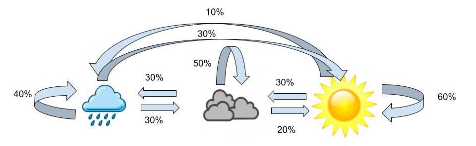The probabilities above are the transition probabilities. Now since we aren’t in Wisconsin, we can’t actually observe the weather, but John has a fashion blog where he posts pictures of his outfits so we are able to observe these. From these observations we know that when it’s sunny out John has a 70% chance of wearing yellow, a 20% chance of wearing blue and a 10% chance of wearing grey. Now when the weather is cloudy, John has a 50% chance of wearing grey, a 30% chance of wearing blue and a 20% chance of wearing yellow. Lastly, when the weather is rainy, John has a 80% chance of wearing blue, a 10% chance of wearing yellow and a 10% chance of wearing grey. These probabilities are the emission probabilities. Combining the emission probabilities with the transition probabilities we’re left with the visualization below.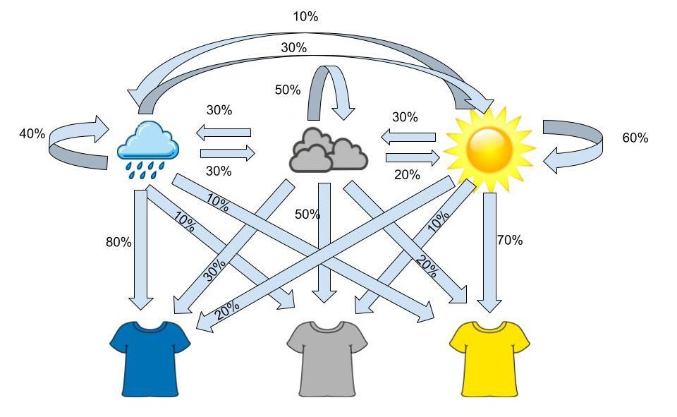The visualization above outlines the framework for a hidden markov model. Over a sequence of days, we make observations of John’s outfits and from this sequence we can determine the pattern the weather most likely took over that sequence. For example if, over three days, we observe the sequence of yellow shirt, yellow shirt, grey shirt, the most likely sequence of weather, based on the transition and emission probabilities, would be sunny, sunny, cloudy.## In a Genetic ContextNow that we understand a little more about HMMs, let’s translate that knowledge to a genetic context. In this case our hidden sequence consists of the origin of the person's genome and the observed variables are the person’s genotypes. Using genome sequencing we’re able to determine the individual SNPs within a person's DNA, but just because we know what the particular SNP is doesn’t mean we know the ancestral origin of that section of the DNA sequence. Using the STRUCTURE software, that is based on HMMs, we can attempt to determine the region of origin of the individuals. The equations below are the framework for the software: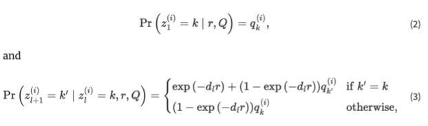The first equation explains the probability for the origin of the first loci. After the origin of the first loci is determined, the software switches to the second equation where the hidden markov model becomes more obvious. The second equation has to do with moving from loci to loci and from one loci to the next. STRUCTURE has two options, the first being that the origin stays the same, summarized by the top equation. There are 2 ways to stay within the same origin, the first being no recombination occurring between loci. If we move from the first loci to the second and no recombination has occurred, there’s no way for the origin to differ. Now there’s also the chance that recombination has occurred, but it’s still possible that the recombination is still from the previous origin, summarized by the second term in the equation. The term exp(−dlr) represents the probability of no recombination occurring given the recombination rate (a poisson process) and the distance between loci. It follows that 1-exp(−dlr) would be the probability of recombination occurring, but k’ = k which explains the population of origin staying the same from one loci to the next. The second equation again calculates the probability of recombination occurring, with the expression 1-exp(−dlr), but here we change the population of origin for this chunk of the DNA as k’ is not equal to k.Now that we have a bit of a better idea of the equations STRUCTURE uses to sift through the genome we can start to understand how the model runs. The STRUCTURE software can be found [here](https://web.stanford.edu/group/pritchardlab/structure.html), and is free to download. Now the first necessary item to run structure is genetic data. There are a few issues I’ve run into regarding the data formatting, the first being that you need column titles for the chosen SNPs. Individual and population markers are also necessary, however the population markers don’t seem to have too many constraints. The table below shows the ancestral percentages for individuals when a population marker was given for two distinct populations and then again when the marker was set to 0. As is evident in the table, the inferred clusters are almost exactly the same across the two tables despite the given population being different.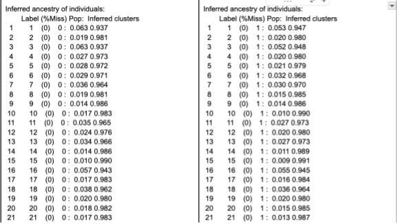When running, STRUCTURE reads the mainparams document within the same folder as the program, so this document is where you would set all the parameters that structure relies on. The only assumption that is required for STRUCTURE is the number of populations the data comes from, so this will differ depending on the data, but an accurate assumption is crucial for STRUCTURE to run accurately. The rest of the mainparams file contains a number of other parameters including the number of individuals in the data, number of loci, along with others. Accurate parameter definitions are crucial for the program to run correctly.# Results```{r}hmm_results <-read_csv('Data/HMM Results 1000 SNPs.csv')real_results <- region_dna %>%filter(generation ==10) %>%mutate(id =1:n(), .before = current_square) %>%select(id, Region1Percent, Region2Percent) %>%rename(ActualReg1 = Region1Percent,ActualReg2 = Region2Percent)combined_results <-left_join(hmm_results, real_results, by =join_by(id))combined_results %>%ggplot(aes(x = ActualReg1, y = HMMReg1)) +geom_point() +theme_minimal() +labs(x ="True Region 1 Percent",y ="HMM Predicted Prediction",title ="How does the Hidden Markov Model Do?")```From the scatter plot, we can see that there is a fairly linear relationship between the "true" Region 1 percent and the prediction from the Hidden Markov Model. True is in quotes because it is as accurate as can be determined, but because it is not guaranteed that parents will each pass exactly 50% of relevant SNPs to their child, there could be some variation that is not accounted for in the "true" percentage calculation. So, while unlikely, it is possible that the Hidden Markov Model is more accurate than the "true" percentage.Of the 999 individuals present at the end of the simulation, the HMM determined 724 of them correct within 5 percent. That is, if the true origin of an individual was 80% region 1, the HMM predicted the individual's origin was somewhere between 75-85% region 1.```{r, eval = FALSE}combined_results %>%mutate(Reg1Error =abs(ActualReg1 - HMMReg1),Within5Percent =ifelse(Reg1Error <=0.05, "Yes", "No")) %>%group_by(Within5Percent) %>%summarize(count =n())combined_results %>%mutate(Reg1Error =abs(ActualReg1 - HMMReg1),Within10Percent =ifelse(Reg1Error <=0.1, "Yes", "No")) %>%group_by(Within10Percent) %>%summarize(count =n())```That error rate of 5% though, does not need to be set in stone. If we set the accepted error rate to 10%, the HMM predicted 881 individuals correctly.```{r}error_rate <-tibble(errorrate = (200:1)/1000,correct =NA)for (i in1:nrow(error_rate)) { errorrate =as.numeric(error_rate[i, 1]) correct_number <- combined_results %>%mutate(Reg1Error =abs(ActualReg1 - HMMReg1),Within10Percent =ifelse(Reg1Error <= errorrate, "Yes", "No")) %>%group_by(Within10Percent) %>%summarize(count =n()) error_rate[i,2] =as.numeric(correct_number[2,2])/999}error_rate %>%ggplot(aes(x = errorrate, y = correct)) +geom_point() +scale_x_reverse() +theme_minimal() +labs(x ="Error Rate Threshold", y ="Percentage Below Accepted Error Rate", title ="Prediction Accuracy")```## LimitationsA few limitations that could be addressed in further work on this project include: more accurate representation of genetic data, non-random population movement, and more realistic passing down of genes. The genetic data we simulated only included 1000 SNPs and the full human genome contains around 3 billion base pairs, so the overall size of the data wasn’t the most realistic. SNPs are also more random than we determined them to be, so rather than the first 500 SNPs being different between the two populations and the next 500 being shared between the two, a better interspersing of SNPs would better replicate reality. STRUCTURE also uses the assumption that genes are passed down in “chunks” - replicating the idea of linkage - and our simulations did not take that into account. With that in mind the passing down of genes was not representative of reality. The movement included in this simulation was also completely random, where in reality there are motivations behind why/when/where people move, that our study did not capture.# ConclusionUsing a Hidden Markov Model, we can accurately determine a individuals origin in a simulation study.


